This has been a much bigger issue in the past when the new design hasn’t launched yet, but even after new design launch, SE still acts a little ridiculous at seemingly reasonable window sizes.
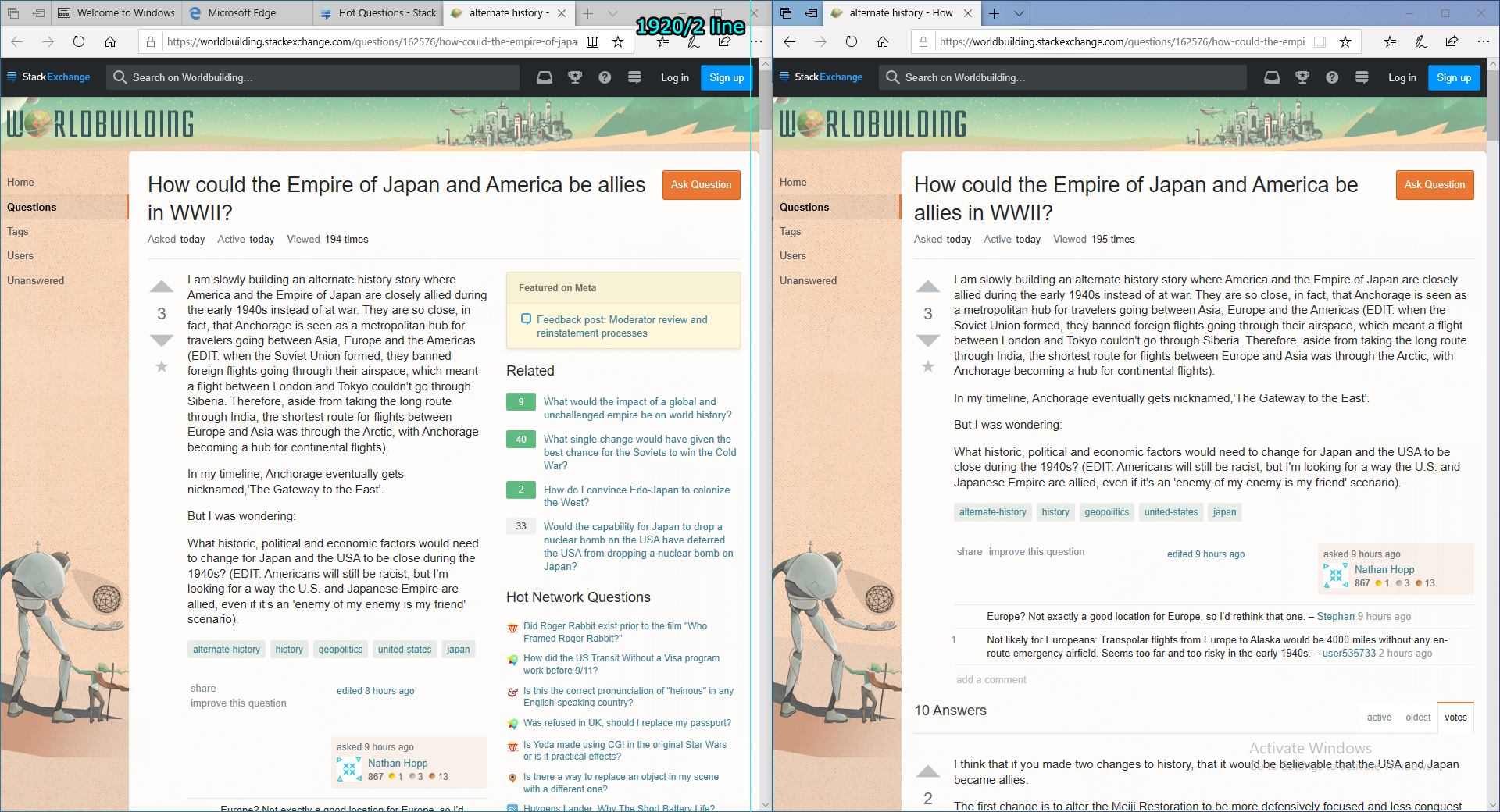
Considering 1920x1080 is one of the most common display resolutions used around the world, it would make sense to support half-width browser window sizes for when you’re looking up something on one of the Q&A sites and have a Visual Studio open on the other half. If you’re not familiar with this window arrangement, here’s an instruction page from Microsoft on how to do it with the mouse and keyboard shortcuts: https://support.microsoft.com/en-us/help/4027324/windows-10-snap-your-windows
Here’s an example of how badly the pages on SE start looking when you size it just a bit wider than the half screen width:
It used to be much worse where the “Ask question” button went off-screen and the right sidebar was halfway out and it’s been that way for years. Learning from old mistakes, let’s strive for the best with our responsive design.
Yes, please. Our site should not assume particular window sizes, bake in widths for particular components like the 300px reserved for SE’s right column no matter the window size, and should handle reasonable amounts of zoom. This is a frequent irritant for me on SE.
This is standard responsive design. In general, I’ve found Bootstrap’s responsive breakpoints are a good starting point for good responsiveness - that’s not to say we need to use Bootstrap, we can just copy the numbers and build on that base.
As for a minimum size, I use 360px - that’s a reasonable assumption now, as not many screens are narrower than that. Most smartphones are bigger than that, but if we design to support 360px as a minimum size, we’ll get a very high support percentage.
Your post leads me to another question which I’m not sure has been discussed or not yet. Perhaps I should post this as it’s own thread (please let me know if you think I should), but will we be creating our own frontend framework or using an existing one such as Bootstrap, Formantic-UI, Foundation, or etc?
Edit: Posted this same question in the #front-end-communication channel on Discord.
I have no idea about how useful it would be to use one of the frameworks or create something of our own. What does SE use for its list of tags textbox editor for example? Is that a standard component in any framework or should it be written from scratch? I guess this should be discussed in a separate thread where more web-dev savvy folks can weigh in.