What should the main page show?

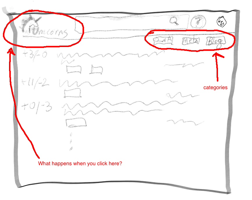
Imagine a Codidact site, unicorns.example.com. The Unicorns site has categories for Q&A, Meta, Sandbox, and Blog. Each category has a tab or some other visual indicator on all pages of the site, so it’s easy to jump to any of these (and if I’m not mistaken, they’ll have URLs like unicorns.example.com/category/sandbox, though don’t hold me to that).

What should a person see on the main page at unicorns.example.com? We could say that this is “main”, i.e. Q&A, but a site might want to selectively or categorically mix in posts from other categories, like that blog that’s updated only once every week or two. And since there’s a Q&A tab/button/whatever already, the front page can be different from that – Q&A should be only Q&A, but needn’t be the only place Q&A shows up. And the vast majority of content will, of course, be Q&A.

On SE, the main page and the “questions” page show slightly different content – mainly, very-downvoted questions are omitted from main but shown on questions. That’s a pretty minor difference most of the time; can we do better?

I’m imagining that Unicorns could define its main page to show, for example, all questions at a certain score threshold (that are not duplicates?) plus blog posts plus meta posts that have a moderator-only tag (like “featured”). Meanwhile, a site that has different categories or different patterns of usage could define something else.

A site could even have more than one Q&A category; for example, some people here have talked about wanting to be able to separate beginner questions, and I can imagine Mi Yodeya collecting its Purim Torah questions into a category. The Q&A category is all Q&A, but all Q&A isn’t necessarily in the Q&A category.

Ultimately we might support user customization (filters or queries), but that’s definitely not MVP.

The functional spec describes question lists and categories but doesn’t address this gap, a page that logically sits “above” any one category by being the root page for the site. That’s my fault, and now that I’m writing use cases I realize we need to figure it out.

6 Likes

I suspect I’d cope better with understanding exactly what is being asked here if presented with some sketchy graphical input. Meanwhile I am a little (or more than a little!) confused about where Announcements, Help, FAQ, Chat (maybe?), Legal, Mod Contact, Tags etc. fit in. (Perhaps the plan is for a Home page as well as a Main one.)

I wonder whether, if the main page and the “questions” page are only slightly different, just one (for now?) would be sufficient.

Here’s a crude sketch. If you click on one of the category buttons (Q&A, Meta, Blog in this example), then you should expect to see only posts in those categories (and that button should be highlighted to show clearly what you’re looking at, and/or maybe there’s an in-page header above the list of posts). What happens if you go to the main page or click on the “home” icon/graphic/nav, circled here?

4 Likes

Thank you. That really has helped me. It is rather a “gut reaction”, but as it is not a button I’d rather it was not active. And I’d consider replacing the body (Q samples in your sketch) with whatever the icon would have led to.

But (and maybe I should have said so first!) I am not a designer (is probably obvious), just a user, and one who prefers simplicity. I don’t see benefit from ‘duplicating’ a few Qs on this page when they are all available with just one more click (on the category button), where presumably I can make my own selection or the basis that suits me (or, if no filter option, at least gives me “the whole picture”). I doubt I would ever visit Codidact just for the sake of Qs on the “Main” page. (Ie I am very likely to click again anyway, if landing on this page and interested in Qs).

The body might be a good place for Announcements and a few details of what the buttons are for (so one can see what one is going to rather than having to go there first to find out. eg SO meta has “This site is intended for bugs, features, and discussion of Stack Overflow and the software that powers it. You must have an account on Stack Overflow to participate.” but that is shown when already within SOmeta.

The ‘description’ for the Blog button might just be the latest blog title, so a user would not need to click that button just to find out that nothing has changed since a previous visit.

I’m used to a logo or similar being a link. Notice how it works here on this forum, where clicking the Codidact logo takes you to the main page, or on SE where clicking on the site logo takes you to the main page.

Whatever this page is, it’s what visitors will first see when they follow the top-level link. SO changed that page (for logged-out users) to show a giant ad, making it hard to find the actual Q&A content. That’s a mistake IMO. I do agree that we should show some introductory explanatory text along with some actual questions. Signed-in users should be able to dismiss that so that next time they visit the page they can jump straight to the content they came for.

Also, I think we can use the page to show a blend of content that isn’t from just one of the other categories. If you just want the Q&A go there; if you just want the blog go there; etc – but maybe there’s a place for showing Q&A alongside recent blog posts.

Having mouse-over text (or mobile equivalent) on the category buttons with the title and last-modification time of the latest entry sounds useful! And that, unlike an “N new entries” counter, is global and doesn’t have to be computed for each user.

4 Likes

One thing that could be on the main page is a short description of selected categories. Not a detailed description (that should get its own page). In the unicorns example, you might describe the Q&A and Blog categories, but not the sandbox and meta ones. There should definitely a link to the complete list of categories (including retired ones if we implement that; since retired categories would not show up as tabs, the categories page would be the only way to get to them).

Also, the main page should have a short description what this community is about.

So the main page design could be something like this:

#=============== Browser Window ================#
#  Unicorns [search bar           ] (icons)     #
#-----------------------------------------------#
#      What you always wanted to know about     #
#        Unicorns, but never dared to ask       #
#-----------------------------------------------#
#  Important categories:      >All categories<  #
#    >Q&A | Main Questions and Answers<         #
#    >Blog | Member's thoughts about Unicorns<  #
#-----------------------------------------------#
#  Selected entries:                            #
#   +5/-0 [Q&A]  >Are there several species of  #
#                unicorns?<                     #
#   +8/-1 [Blog] >The economy of raising        #
#                unicorns<                      #
#===============================================#

Here >...< denotes links.

4 Likes

Good idea on calling out the important categories and linking to the full list.

For “selected entries”, how do you see items being chosen? I’m leaning toward letting each site plug in a site-default SQL query so they can decide what categories to draw from, any score or tag restrictions, etc. Later when we add support for user customization, a user would be able to override that with a personal filter.

2 Likes

Maybe I’m in the minority here, but I’ve always disliked it when web pages tried to tell me what was “important”, “most popular”, “selected” or whatever. It immediately leaves me wondering what their criteria are, and how those probably don’t align with what I think is important. On commercial sites, “important” probably means “highest profit margin for us”. We don’t have that specific issue here, but I would still rather avoid it.

What I want to see when I first get to the site is some description of what the site is all about. Diving right in to “catagories” and the like is confusing without “catagories” being defined and explained. Once the front page provides the background and introduction, then there can be a “dashboard” page or whatever that you use regularly after already being familiar with the site. That would be the page I save a link to, but it would not be the page I want to be shown first.

Context is important for making sense of everything else. I think of it as the framework to hang new information on. When you have no context, new information is just a bunch of babble flooding at you.

4 Likes

I’d vote for Q&A only with similar mechanisms like SE, specifically with regards to hiding hideous (tbd) stuff.

Why?

  • I operate under the assumption that Q&A is the main feature. Everything that detracts from it muddies the water and brings complexity that is not very helpful. With the visibility of meta and blog on your sketch in the upper right corner we have enough visibility for the community pets.
  • The second assumption is that the rate of new content is probably a few orders of magnitude different between Q&A and “the rest”.
  • The third and last assumption is that clicking on the site logo will lead to the same place if I just put in unicorns.codidact.com. That’s what we are used from website logos, going back to the home page. This circles back to assumption one. The home page of a Q&A site should show questions and answers. Nothing more.
2 Likes

What if one of those categories is “canonical”? On SE canonical posts have to be shoehorned into Q&A, but on Codidact they might take the form of carefully curated wiki pages. Should new canonical posts be as visible as the Q&A they support?

I agree that Q&A should be the bulk of what people see. Just by sheer numbers that’s going to be the case anyway. Communities just aren’t going to be churning out blog posts or wikis or meta posts as quickly as they do core Q&A. (Well, unless something very strange is going on… never say “never”, after all. But I’m talking abut typical patterns.)

Agreed. My question is what to show on that page. We don’t want a pure duplicate of the Q&A category (after all, why have both in that case?), and we do want to show posts (not an ad like SO).

I think there’s a place for a dismissible introduction, too. Yes we want our interface to be as intuitive as possible, but something about site scope, at least, would avert a lot of pain later with off-topic questions (“but I didn’t know!”).

3 Likes

That’s the key! The assumption may not be correct. Codidact is not only a Q&A site. It is a collection of knowledge, not quite like Wikipedia (mostly) but also not exactly the same as StackExchange. StackExchange is almost exclusively a Q&A site. Attempts to do other things with it have largely failed. The idea here is to have something that can support other types of knowledge. Will Q&A be the largest part? On most, if not all, communities, yes. Will it be the most interactive part, particularly for casual users? Yes. But many of us have other things we’d like to have be parts of Codidact instead of afterthoughts, and the Home page is the place to tell people about them. Especially people who come here thinking “just another Q&A site”.

4 Likes

The natural criterion for categories is whether those categories are useful for newcomers to browse. If you start reading the site, you’ll not (yet) be interested in meta discussions. And you’ll not be interested in the sandbox until you start posting.

The obvious criterion for posts is a combination of activity and score (and being in the right category; you definitely don’t want sandbox posts on the homepage).

That’s on my suggestion. Right below the top line with the logo, search bars and icons.

1 Like

We shouldn’t label the content on the front page as “important” etc; we should just present content. And because the page is the “front door”, so to speak, we should try to arrange for “good” content, whatever that means to the community whose front door it is.

2 Likes

I think of it as the outside of the front door. There shouldn’t be any content there at all. You should see the sign on the door explaining what to expect when you open the door and enter. That’s when you get the content.

2 Likes

I think of it more like a traditional store window. Walk down the street and you see a sampling of the best the store has to offer.

Which reminds me of an old joke…

2 Likes

[partly joking] I could see Codidact showing this when visiting via CLI (e.g. telnet). Future (non-MVP) feature?

2 Likes

We could start a new trend - the ultimate in responsive browsing:

  • Desktop mode
  • Tablet mode
  • Phone mode
  • 80x24 Text mode (green on black by default)
3 Likes

People who find the site via a search engine will find a specific topic, not the home page.

Perhaps – instead a dumb list of popular or recent topics – the home page should be entirely (nothing but) a community-authored Welcome, plus useful links to everywhere – especially a short description of each Category.

If someone wants to bookmark a Category (so they can easily visit topics in future and bypass the home page) they can.

There are two kinds of users i.e. new and regular, and the home page shouldn’t be optimised only for the latter – the Welcome is important otherwise new users don’t know how to use the site.

Perhaps a regular user might be able to customise their own view of the site – which category/categories they see, specific topics which they may be following, etc.

1 Like

Overall, the SE concept of dropping you right into the Q&A is nice for recurring users, but perhaps not for beginners. It is kind of dropping them in the deep end of the pool and they have to learn to swim from there.

So maybe a separate start page with site scope(!!!), help links, tutorials etc where everyone lands until they have a login name and a certain amount of rep?


And then (not MVP) maybe for returning users, an option to customize the start page so that you don’t land in the main flood of generic unicorn questions, when you are only ever interested in Norweigan Blue Unicorns specifically and only follow that specific tag. But I suppose you could as well browser bookmark https://unicorns.codidact.com/tagged/norweigan-blue so it’s not a super-important feature.

1 Like

I think we need something in between. @Olin wants a pure marketing page so people have to click through to see whether the site is any good. That’s like covering over the store windows so you have to go inside to find out if there’s anything you’re interested in – selects for determined people, but others who would have been interested will just move on to the next store.

On the other hand, we don’t want to just dump people into Q&A; new users need some better guidance. This is why I like @celtschk’s suggestion (ASCII aside): show some guidance, but also show some of the goods! I’ve been thinking of that guidance as being dismissible, like the blurb we all got when we joined this forum, but I can see an argument for keeping it. Either way, a new visitor who hasn’t yet decided we’re worthwile (such as somebody who followed an intentionally-placed URL) should see content and not just marketing “above the fold”.

6 Likes