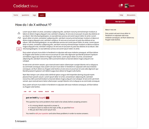
There should be only one font (Open Sans). The “Ask Question”-button has small caps on (same as sidebar header), which serves as a mean to highlight it.
I see your point, however having them “floating” between the banner header and the content box doesn’t look good to me.
The elements of the sidebar are to be decided. This draft focusses on its styles (segmentation with small-caps headers).
I put the help(discussion tabs on the right side for a reason, namely, that they are of less priority for normal site use, however I am not fixed on that.
This is already under discussion here:
I agree. I already made it thicker in my local draft, however I didn’t update this thread:

Possibly, however that is not within the scope of this topic. See here:
The content design is not yet developed in that draft. I have however made another draft for that, which you can see here:
